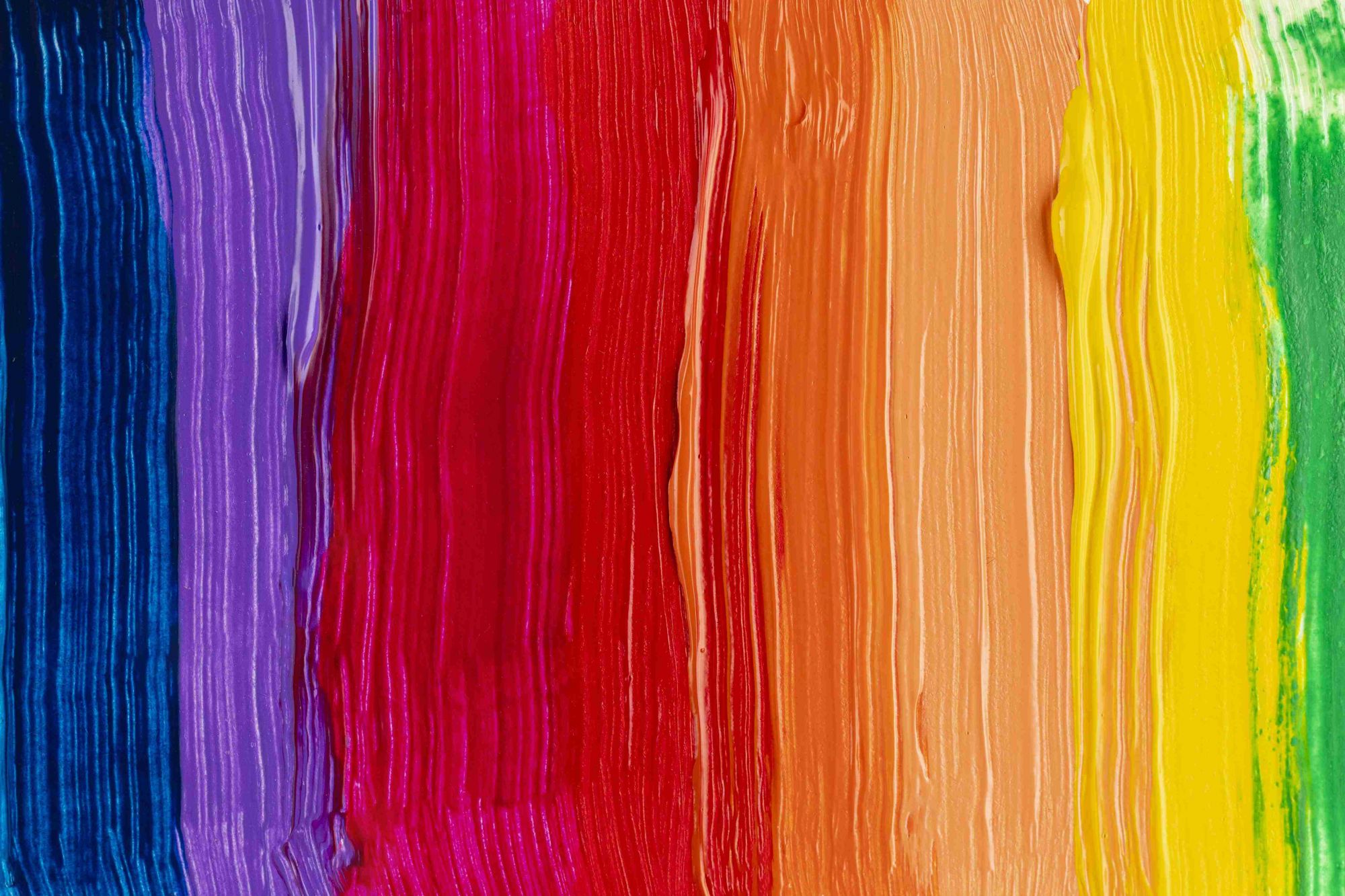
The use of colour theory in design may be a powerful tool for stimulating users' emotions. It only takes a quick glance to see the value of colour. Users' emotions and responses will be evoked by various hues and tints. Online designers do not need to be experts at using colour, but they do need to be aware of its use and the significance of colour in web design. The proper colour should be chosen by a clever web designer who is aware of the many impacts that colours have on the design. To leave a lasting impression on consumers, it's also critical to understand how to mix colour and contrast.
Black colour

The most powerful neutral colour is black, which is utilised on practically all websites. The colour of the match determines its significance. Overuse of black can overwhelm visitors and make the entire design too complicated, bold, and crisp. Black is a popular backdrop colour for websites because it instantly conveys refinement and timelessness. It will look great when coupled with white. At the same time, it symbolizes solemnity, tranquility and depression.
Red colour
Red is a colour that symbolizes youthful vitality and can be used to emphasize strength and importance. In the use of colour in website design, this is the most stunning and exciting colour. It represents power and passion, and is the colour that attracts the most attention. This is why red is often used for warnings and important notifications. If you're designing a website that needs attention, then you might consider using red. But it should not be exposed to too much. Staring at the bright red colour for too long will not only affect the eyesight, but also easily cause dizziness.

White colour

White is a very clean colour, it symbolizes simplicity, cleanliness and virtue. It is often associated with purity and innocence. Websites that simply use white as their background colour tend to be too drab because white is less noticeable. Designers often use other colours to improve the observability of web pages.
Orange colour
Orange is a very unique colour that can be used to convey friendliness and energy. If you want to give your website a sporty and energetic vibe, orange is the best choice. It's one of the softest warm colours, and the only colour that works. Used as a primary colour, it can be vibrant and attractive as a secondary colour that retains its attributes without being noticeable. Almost all cartoon websites are using this colour to show their creativity in animation.

Grey colour

The eyesight is best suited for neutral grey, has extremely low visual recognition and attention levels, and performs well with other hues, producing depressive, hazy, loose, casual, obedient, and reasonable feelings. Other hues, like milk, evoke feelings of sweetness, innocence, and earthiness. Olive and dark brown colours might imply steadiness and serenity.
Yellow colour
Yellow is the colour of happiness and enthusiasm. Its versatility is high, though it depends on how you use its shades. Bright yellows are the most vibrant shades. The shades in the middle will give you a cozy feel. On the other hand, darker shades can give you a retro feel. These shades symbolize wisdom, curiosity, eternity and gold, respectively. Additionally, it is used to stimulate salivary gland secretion, which increases hunger.

Green colour

Green is a colour commonly used in environmental and financial website design, and it symbolizes stability and growth. Although it is a cool colour, it can be used to bridge the gap between warm and cool colours. It can be as peaceful as blue and as vibrant as yellow. Therefore, it is ideal for balancing and stabilizing atmospheres. Dark shades of green give a sense of opulence and money.
Purple colour
Purple is a very noble colour. Light shades are luxurious and romantic, while dark shades are mysterious. For a long time, people have associated purple with royalty and luxury. It can be used to symbolize luxury and wealth, so purple is the best choice for fashion and luxury websites.

Blue colour

Darker colours of blue look peaceful and dependable, while lighter shades provide a sense of security, openness, and tranquilly. Very varied meanings are represented by various colours of blue. Dark blue might feel a touch serious, yet blue generally conveys a sense of security and tranquilly. Lighter colours, on the other hand, are friendlier. While business sites utilize darker tones to demonstrate their dependability and power, social networking sites typically favour lighter and medium shades of blue.
Ivory colour
Ivory colour for website design can give a feeling of elegance, simplicity and comfort. Ivory is a combination of white and cream. However, it is warmer than white, giving people a sense of comfort while showing its minimalistic character. No matter what colour you use in your design, use ivory instead of white to lighten the contrast with the darker colours.

Colour is the most important element in web design. Whether a website looks good or not depends to a large extent on the type of colour used. The colours you choose must match the theme of your website so that they know what the website is about before they browse the content. Be sure to use attractive colours, the ones that are curious and attractive, which will ultimately help you increase your website’s conversion rate.


